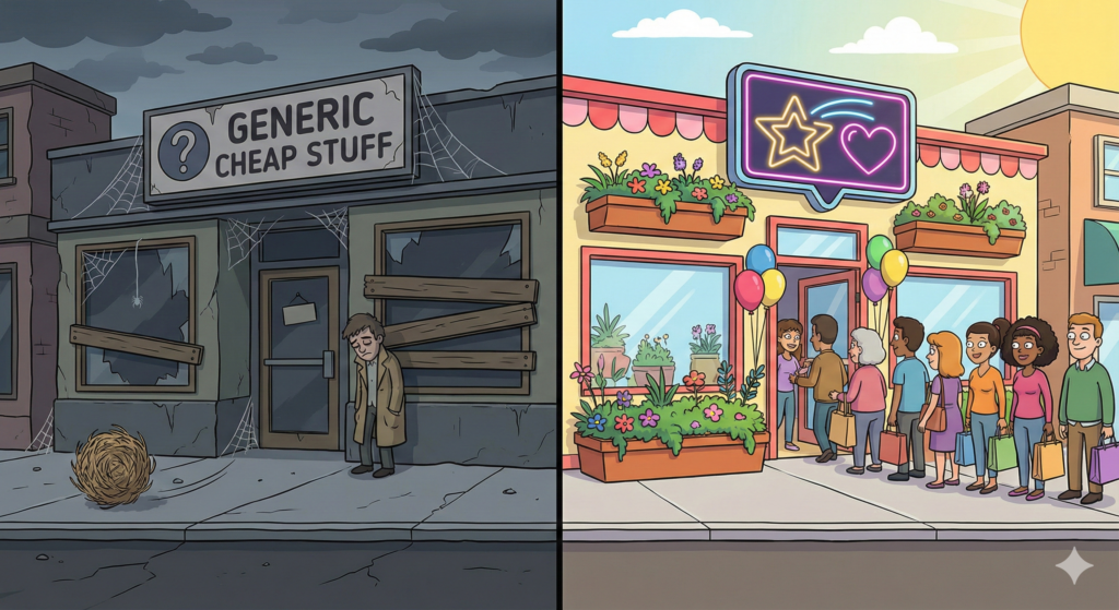
When I opened my first store, it looked… suspicious.
I used the default theme. I used the blurry photos from the supplier. My logo was just text that said “BestDealsForU.” If you visited my site, you probably thought: “If I give this person my credit card, will they steal my identity?”
I made a few sales, but nobody came back. I was running a “Lemonade Stand” on the side of the digital highway. People bought from me because they were thirsty, not because they liked my lemonade.
Then I looked at my favourite brands. They felt like vacation. They felt safe. They felt like they had a soul.
That was the day I decided to stop being a “Dropshipper” and start being a “Business Owner.”
Most people think branding means paying $50 for a logo on Fiverr. That is not branding. That is decoration.
Branding is a Vibe.
Think about it like a person.
- The “Scammy” Store: Is the guy in a trench coat trying to sell you a watch in an alley. He is nervous. He talks fast. He disappears quickly.
- The “Real” Brand: Is your cool friend who invites you over for coffee. They dress well. They listen. They remember your name.
Your goal is to be the Cool Friend.
You don’t need a million dollars to look professional. You just need to fix the things that scream “I am lazy.”
1. Fix the “About Us” Page (The Story)
A scammer never tells you who they are. A real brand has a story.
- Bad: “We sell high-quality products at low prices.” (Boring. Everyone says this).
- Good: “I started PetLovesMe because I was tired of buying dog toys that ripped in two days. I wanted to find toys that could survive my Bulldog, Buster.”
- Why it works: It proves a human runs the store.
2. Custom Photos (Stop Stealing)
If your product photo has Chinese text on the box or looks like it was taken in a dark warehouse, people will know it’s cheap.
- The Fix: Order the product yourself. Put it on your kitchen table. Take a photo with your iPhone in natural light.
- The Result: Even a simple photo taken by you looks 100 times more trustworthy than a stock photo found on 50 other websites.
3. Pick a Colour Palette (And Stick to It)
Don’t use red buttons, blue headers and green text. It looks like a circus.
- The Fix: Pick 2 main colors (e.g., Navy Blue and White) and one “Accent” color (e.g., Gold).
- Use these colours everywhere. On your site. In your emails. On your Instagram. Consistency builds trust.
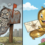
Dropshipping has a bad reputation because the packages are ugly. They arrive in a grey plastic bag, wrapped in yellow tape, with a weird customs label.
You can’t always change the bag, but you can warn the customer. Or, if you are growing, you can move to Private Labeling.
This is when you ask your supplier to:
- Put your logo on the product.
- Put a “Thank You” card in the box.
- Use a custom box.
It costs a little extra (maybe $0.50 per order), but it turns a “transaction” into a “gift.”
A brand has a voice.
- Nike’s Voice: Inspiring, tough, energetic.
- Disney’s Voice: Magical, happy, family-friendly.
What is your voice? If you sell Skateboards, don’t sound like a Lawyer (“Pursuant to the purchase agreement…”). Sound like a Skater (“Ready to shred? Your board is on the way.”).
Stop using the default automated emails. Rewrite them to sound like you.
A “Scammy” store is a tent. You set it up fast, you make quick money and it blows away in the wind. A “Real Brand” is a house. It takes longer to build. You have to lay bricks. You have to paint the walls.
But a house has value. You can live in it for years. You can sell it for a profit.
So, take a look at your store today. Does it look like a place where you would shop? Or does it look like a trap?